6. Socio-cultural Background ~ Discourse
What are we interested in?
How graphic design takes part in society!
How can we study this?
Before starting the analysis, we have to put on our sociological glasses. This will allow us to see a bit further of what is evident, create assumptions, and even prove some of those ideas within an empirical research. We will guide you with some key questions to elicit an answer based on your own experience, we will simply search with Google, and of course, we need some common sense.
Key questions to consider when analysing a piece:
- For what purpose was this designed?
- Who designed this for whom?
- Which techniques were used?
- To which style does it refer to?
- What is the socio-cultural precondition for it?
- How is the graphic design connected to the morals of the society it emerged from? (aka discourse)

What did we find out?
1. For what purpose was this designed?
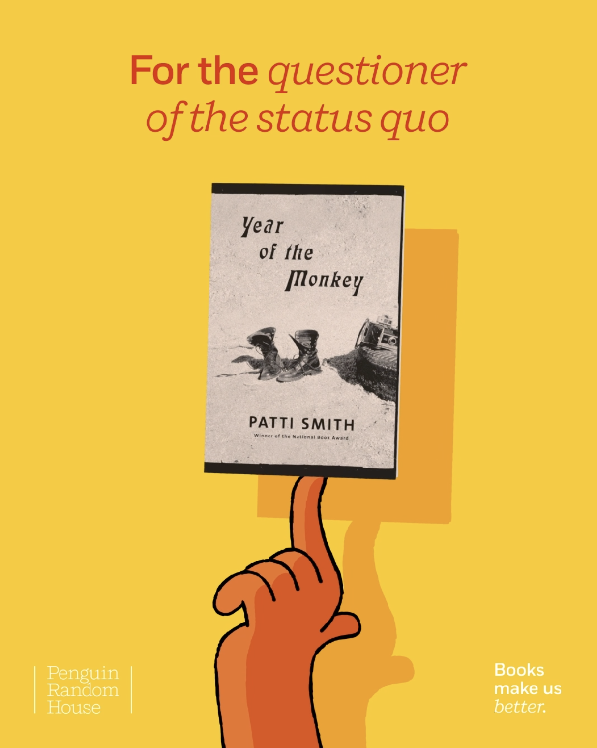
This animated piece was created for an advertising campaign called “Books make us better”. Its goal is to motivate people to buy books as gifts during the Christmas season, which we know, is a gift giving tradition.
The campaign consists of a micro-website and outdoor posters placed in some subway stations in New York. The pieces were adapted to be used in social media posts, but particularly to be shared and downloaded as a video clip by those who interacted with the website.

2. Who designed this for whom?
Time to research in Google more about the piece and the campaign it belongs to:
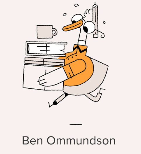
This campaign was design by Anyways, a creative studio based in London in collaboration with animator and illustrator Ben Ommundson. Their client, Penguin Random House wanted to spice up the cashing machine this holiday season by promoting books as gifts, allowing givers to easily get a recommendation.

3. Which techniques were used?
With common sense, what do you see, how would you do it?
One approach could have been a handmade illustration later scanned and placed into a vector rendering software. Perhaps Adobe Illustrator was used, coloured and exported to an animation software, where the parts where animated using keyframes to track movement, position, size, colour etc. Then exported into a video clip and uploaded into their website.
Another approach could have been illustrated digitally straight into Adobe Illustrator, then animated using Adobe After Effects and even imported into a 3D software to generate the lightning. Exported into a video and uploaded to the website. The piece is then finalized by a simple logic that produces this design interactively.

4. To which style does it refer to?
Does this piece remind you of something else? Maybe even reverse google image search could help you bring words to the style you have in mind.
It takes particular elements we can see in classic animated cartoons but adds a bit of flat design. A minimalistic composition often used in web and application design.

The style of the stroke is similar to those cartoon characters from comics, like Charlie Brown, Garfield and others. It seems it borrows the style from old animations that were done frame by frame, with jumps in the continuity of the strokes as if were drawn individually and then viewed with a stop motion technique.

5. What is the socio-cultural precondition for it?
In a way, to try and answer this question will require us to dive deeper into the almost subatomic particles that compose this piece. What are we looking at, where is it located, and why are we looking at this particular graphic design?
As we are talking about an animation in a website that wants to sell more books in the Christmas season, a time where people want to give and receive gifts, we can understand the preconditions as separate or as a whole. However, they seem to be all linked:
People need books. For books to exist, we need paper, ink, authors, stories, printing machines, typesetters, publishers, readers, bookstores, an illustrator or visual artist, computers, web hosting, web designer and developer, Internet, and of course money. We can continue until it becomes nonsense. You get the idea.
6. How is the graphic design embedded in discourse?
During Christmas, brands and products deliver emotional campaigns to touch audiences. Selling this mood for buying. It’s always dark and cold, but there’s always a twist when someone give you something. The gift exchange is a gratifying ritual that fits the role of filling the emptiness of finishing one more year and starting over again a new one. Giving is a way of compensating for all we did or not during the past year.

People in the search for gifts will seek the product online first, might read reviews and find if the content will satisfy its intentions. Unboxings and tutorials on how to use certain things are the most watched videos. So, marketers have realized that our decision making is mostly happening online before placing an item in the shopping cart. This piece responds to the need to fill the information gap in the decision-making process of an online buyer.

Nowadays, we use books as status symbol, lifestyle objects and the source for many self-improvement quotes that have become posts in social media. More people seem to be interested in things that makes them better, even if certain phrases are out of context and placed on top of non-related images. However, we also use them to acquire new knowledge. We read to learn, question and find new information that can helps us improve our conditions.

Sometimes we read to feel emotions through characters, be entertained, and in some other cases just out of curiosity or because we want to learn how to do something in particular. In all meanings, we read to improve ourselves.
What do these results mean?
Giving books as gifts will make you look better than giving a simple coupon. It follows that you are a cultured person, that engages with ideas and wants to share those ideas to someone else. Online shopping results in more and more recommendations for us. Therefore, we might feel the need to buy a book because it touches our interest and has this promise of improvement. But as this is such a common practice, we might feel the urge to show the clever side of ourselves – that we somehow do not take these things too seriously.
Finally, we may understand the tension that comes from the opposition of book vs easyness – is it a semiotic resource that only adds to meaning when the “pull” of the discourse comes to play; the effect is irony? (taking something hard easy) (Note, however that those animated hands are but one possible template; the others are more … serious.)