3. Construction
What are we interested in?
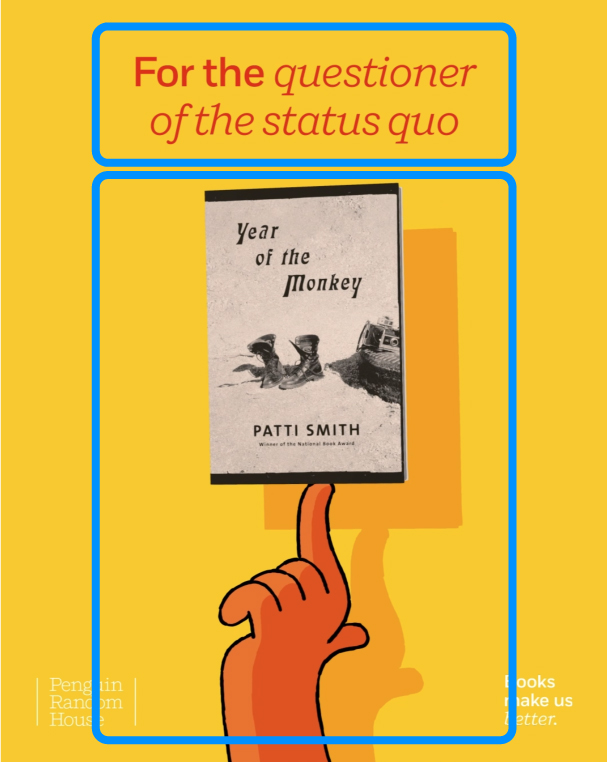
We examine 5 different aspects of a piece:
- arrangement suggested by the format
- overall composition and balance
- color contrasts
- generative principles of axis and grids
- meaning in composition
Our goal is to find out how these elements are put together and if there is a meaning behind their connection.
How can we study this?
What did we find?
What do the results mean?
1. Arrangement suggested by the format

2. Overall composition and balance
Is the piece balanced? Its graphic elements occupy the space along the vertical axis, but the composition shows a balancing act, exaggerated with the swirling movement which at the same time stabilzes the arrangement. The balancing act is pereceived bodily – “embodied”. We can relate the vertical arrangement to our standing posture.
Tip: If the content is placed in the middle, it’s focused, static, and not moving; if the content is moved towards the edges, it gives us a sense of gravity and movement. Keep in mind that white (negative) space is also an element.
3. Color contrasts
The composition of color is another important aspect in this step of analysis. Following Johannes Itten's categorization of color contrasts, we can easily notice that the type of color contrast used in this piece is the contrast of hue (yellow vs. red). We can observe the contrast of color and non color as well.
Tip: Johannes Itten conceived seven methods for color coordination utilizing the contrasting properties: contrast of hue, contrast of light and dark, contrast of warm and cool, complementary contrast, simultaneous contrast, contrast of saturation, and contrast of extension.
4. Generative principles of axis and grids
Grids and axis are networks of lines that structure the positioning of elements and create relationships between them.

5. Meaning in composition
Meaning in composition arises when depending on the arrangement, different elements engage in a relation.
Conclusion
Each graphic design could be dissected in a search for underlying structure that it was built upon. A successful design requires successful composition, meaning that all of its elements are arranged in a way that not only looks good, but is effective and functional, in order to form a cohesive piece.