1. Preattentive Perception

What are we interested in?
- We wonder about the early processing of visual stuff. We want to comprehend what is processed “automatically” (and how and why).
- As graphic designers we are interested in this very first impression of a graphic design because a viewer decides to further investigate the graphic designs after this first perception. Also, a lot of graphic design is experienced by just passing by without viewer’s attention so it is important to know what is actually seen.
How can we study this?
It is difficult! These processes, as they are working quasi automatically, without our awareness, are hard to grasp.
Here are three ways to grasp this volatile perception:
1. With Gestalt Principles we can predict what is automatically processed.
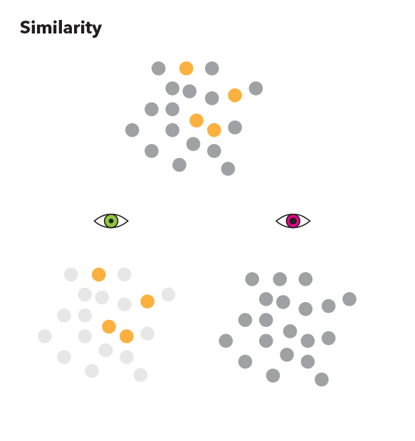
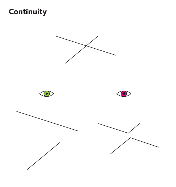
You may ask yourself: What is the big deal with those principles? They are understood! Yes they are. Most importantly, they help us too predict what one would see. They also help to discover unwanted Gestalts!
2. With a “Tachistoscope” we can figure out what a viewer perceives in a very short amount of time
The tachistoscope is a tool to present an image to a viewer for a predefined time. We use the tool to show our graphic design for a very short time, so we (hope that) we may get rid of the viewer’s processing of the stimulus.
Procedure
- Upload the image we want to study to this page →
- Tell participants to look at the screen, click the [Show] button and afterwards let them describe what they have seen.
- Collect all answers and group same or similar data.
- Then, count and rank the information to classify as colour, object, format, etc.
Tip: The Good Gestalt Guide (by Tobias Huber) can be used to find out if an artwork goes according or against Gestalt principles. You might also find unwanted Gestalts which can mislead viewer’s perception.
3. With eye tracking we can find out where a viewer focuses
We can observe:
- Saccades: Very quick jumps of the eyeball
- Fixations: Short stops of the eyeball. This is the moment for acute vision which is deemed consciuos perception
Procedure with the eye tracking device:
- Set the duration of visibility to be 6 seconds
- Choose the graphic design
- Let viewer follow a moving test dot to calibrate the eye tracking device
- Show the design to viewer*
- Collect the results
*We make the participants see another image first to train their eye, then we let the screen blank and show the artwork of interest.
Our test participants’ details
n=5 students from HMKW, from different majors: 2 are from International Marketing and Media Management, 2 from PR and Digital marketing and 1 from Communication Design, 20-26 years old.
What did we find out?
1. By just taking Gestalt Principles:
We look for some
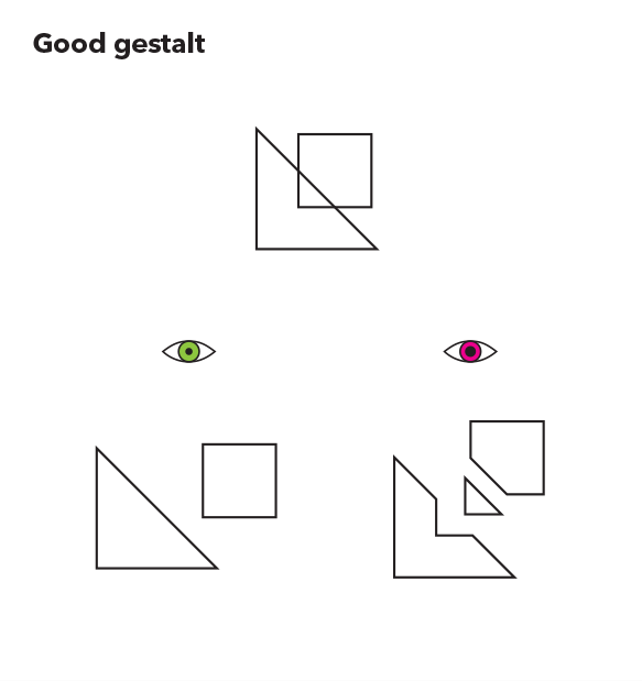
Good Gestalt
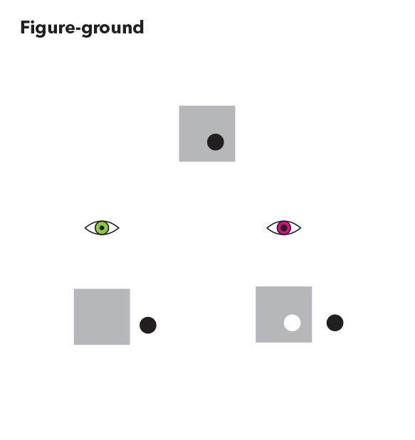
We check if something detaches from a background
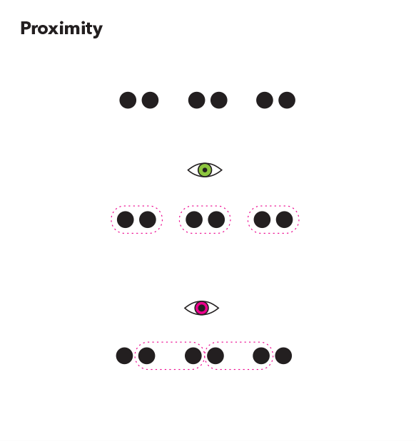
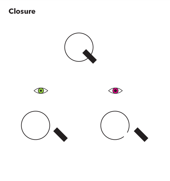
We look for
how things group:
Conclusion
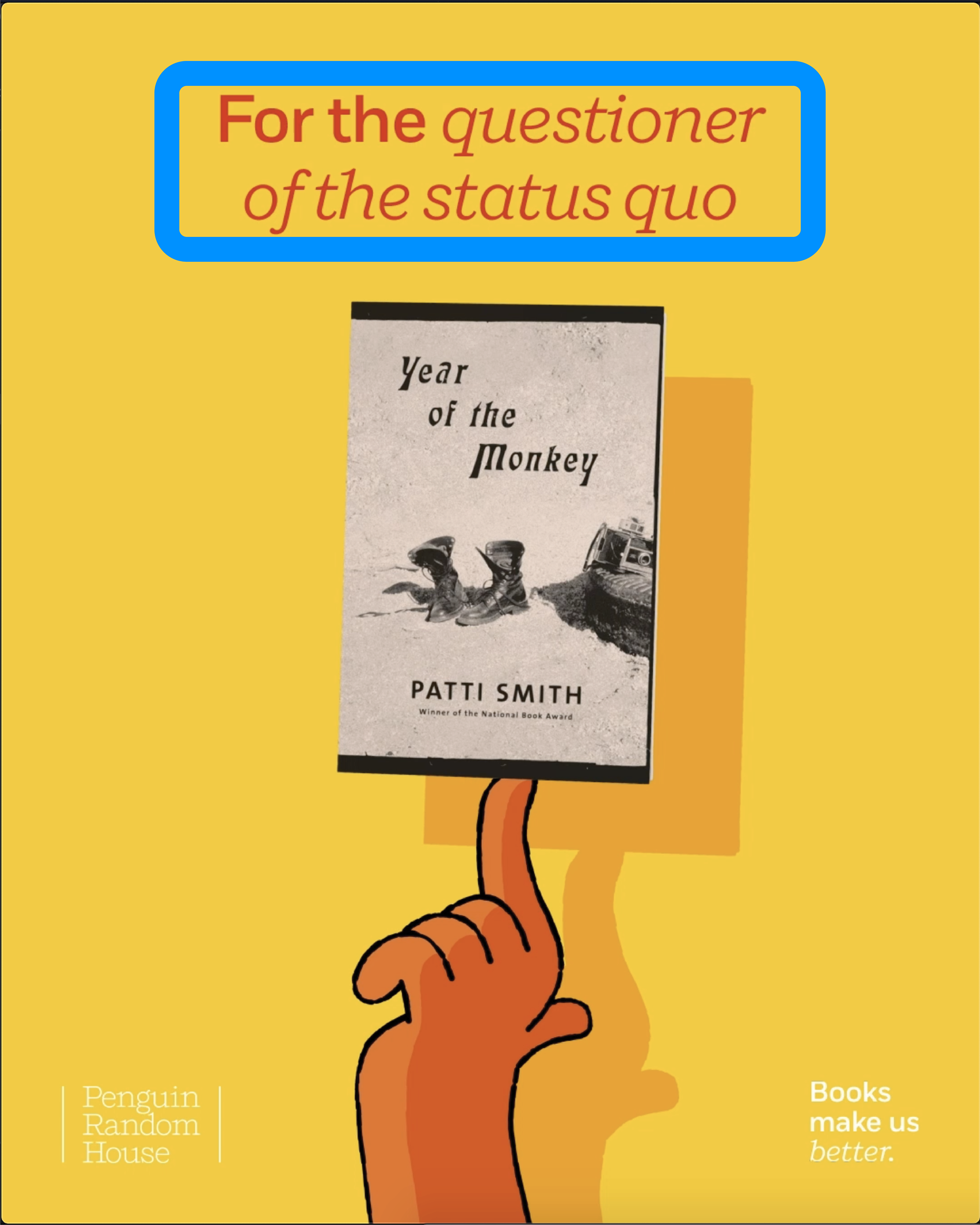
Okay, this time there is no great surprise. What we see when we look closer does not contradict the (assumed) early perceptions as modeled by the Gestalt principles. Where there’s a rectangle is indeed a book, …
What makes things a little more complicated is the fact that this piece is animated …
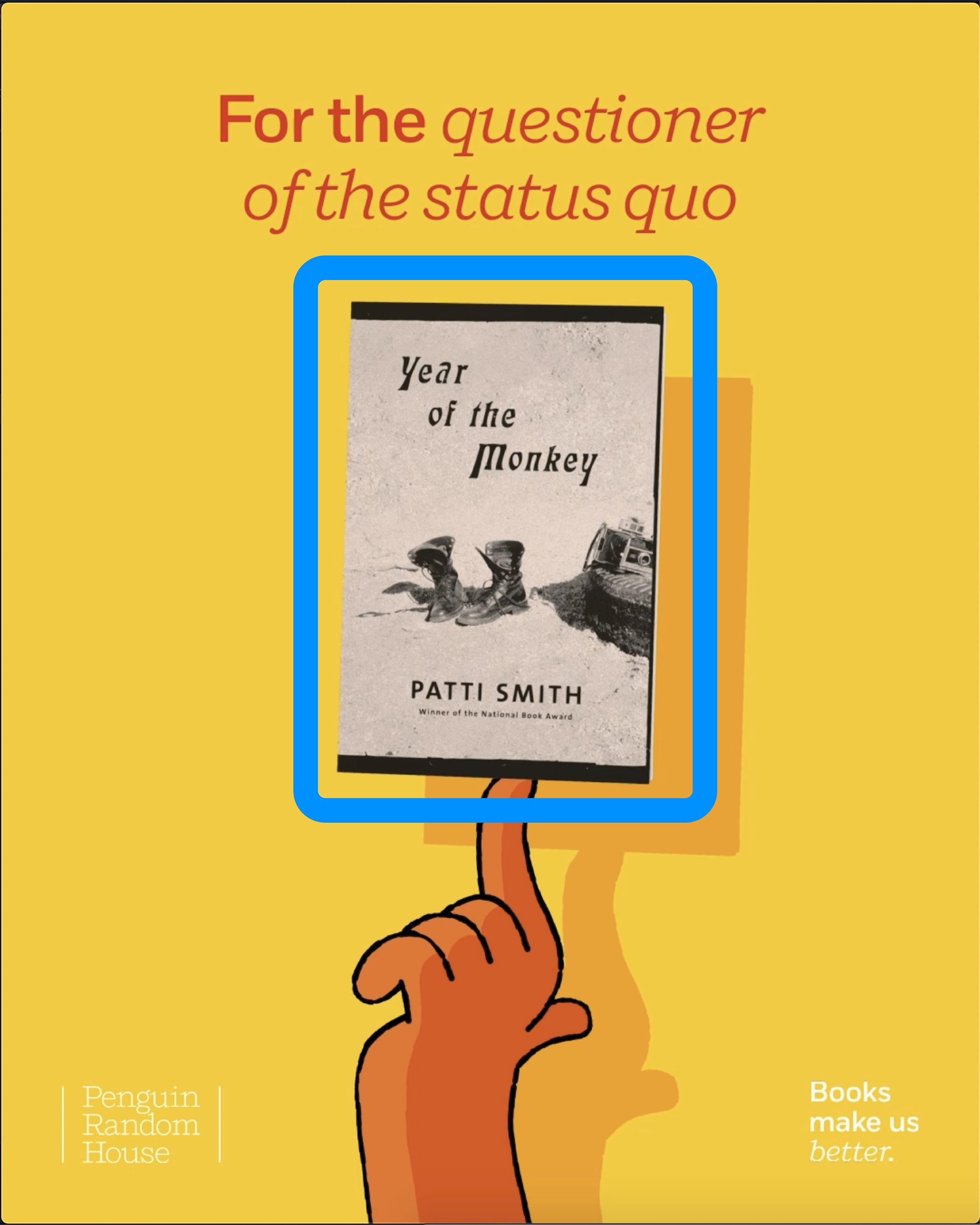
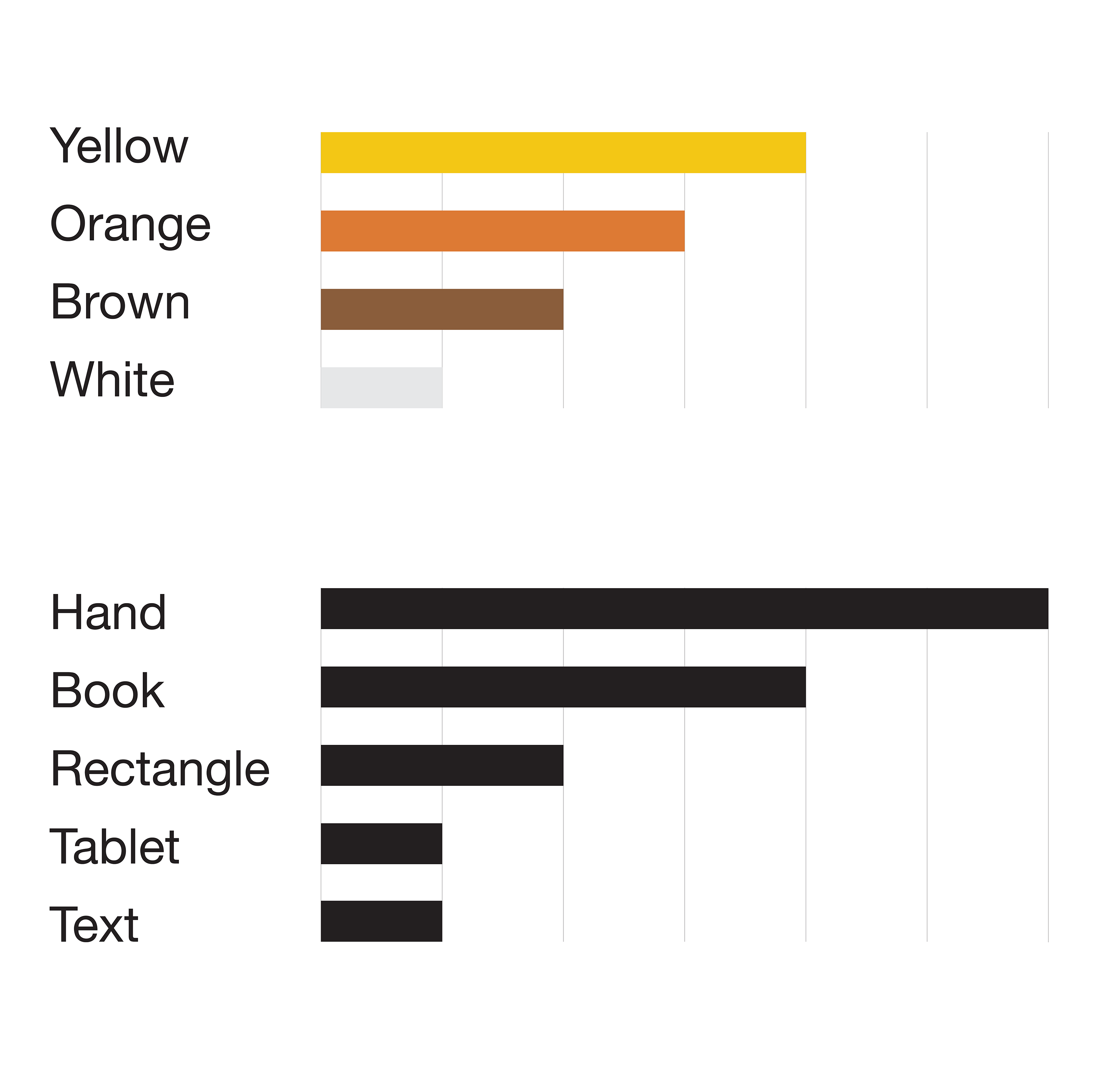
2. What did people grasp (using the Tachistoscope)?
This is what they wrote down after looking for 25ms
(we grouped this already a little with this table):
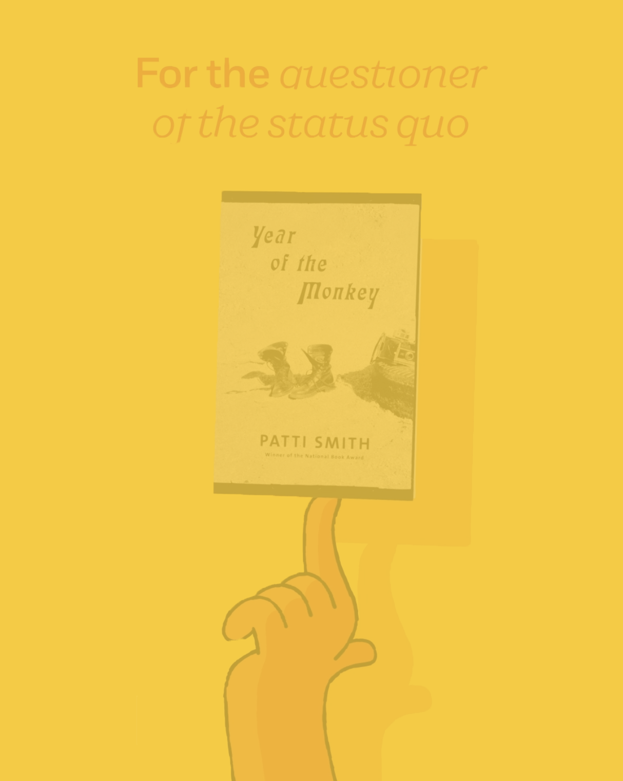
| P1 | hand or figure, orange-brown hand | book or tablet, white rectangle | yellow background | font |
| P2 | hand pointing at | a book | seems like it’s an ad | |
| P3 | a hand, pointing upward | yellow, brown | ||
| P4 | a hand (only a few fingers open) | yellow background | ||
| P5 | hand | 2 or 3 rectangles | color yellow and orange | “year of the monkey” |
| P6 | finger | book | orange |
Grouped and summed up in a diagram:
Conclusion
Some colors, hand, book … so except for the text, the most salient features of this design were grasped by everyone. In a fraction of a second! With Gestalt principles we guessed that the hand(s) would be harder to identify. Obviously, this is wrong. They are identfied easily. So, parts of the human figure are recognized easily, because we know them so well? That would mean that the very first impressions are not only doing basic pattern recognition but do bring out stuff from our memory.
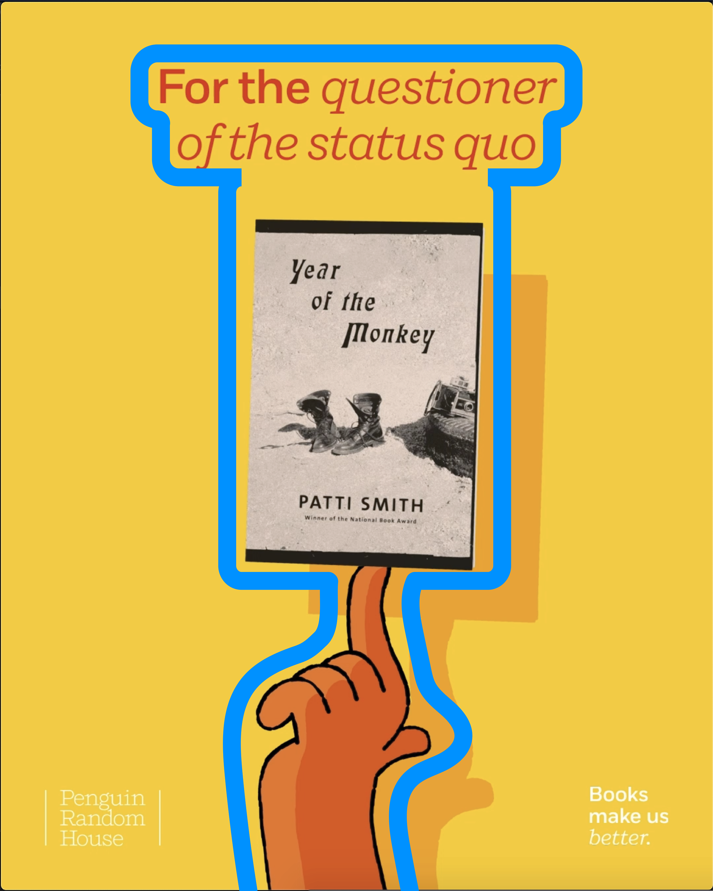
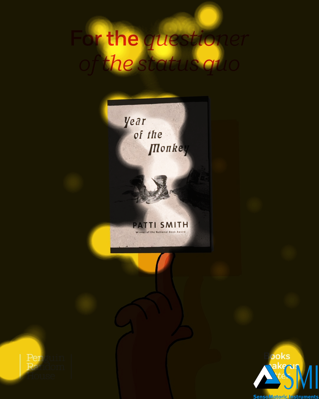
3. Where did people’s eyes focus? (Eye Tracking)
First we have the crude recording of eye movements (saccades) and fixations, when they eyes rest focused on something. We suppose that where people fixate their eyeballs, their attention goes, suggesting a more consciuos processing of the stimulus.
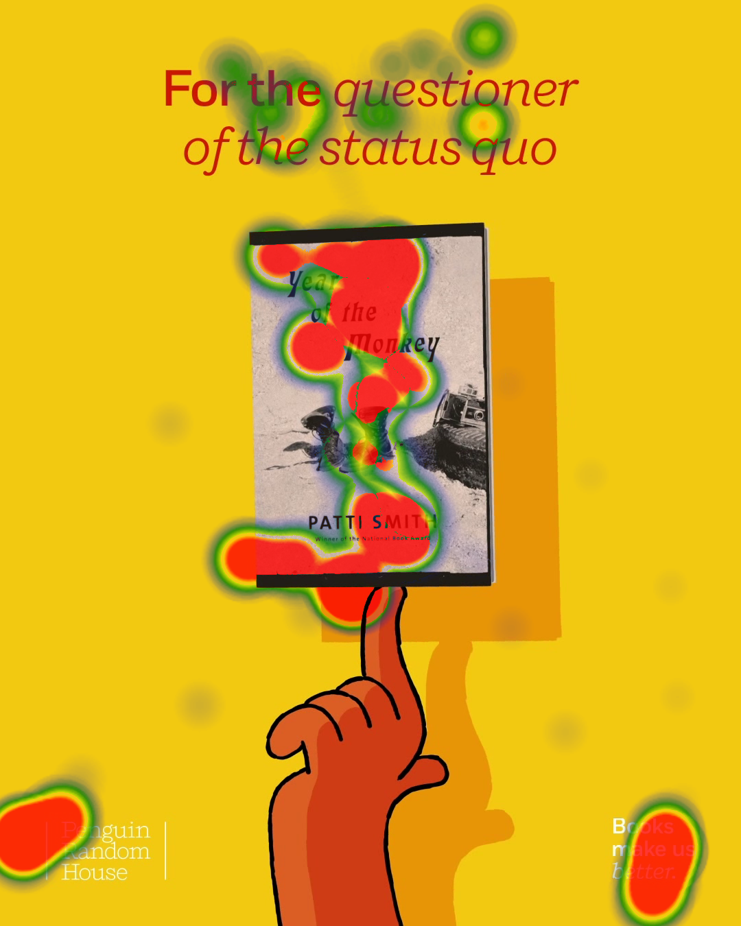
Conclusion
As we can see from results from eye tracking device, you can see that tester sees the book and the header the most, we can notice that the focus from the eye is also on the text on the book. The thing that quite interesting which we get from scan path is that 2 testers actually saw the texts in the lower corners and 3 testers have “a sloth eye” effect from looking at the spinning book.
What do the results mean?
Colors have priority!
Color makes shapes, establishes objects
We know from the tachistoscope experiments that at least a hand was recognized. Human body parts get our attention. We are humans and we are interested in what our fellows are up to. This is learned from early on. Humans as bodies always communicate.
In our case, as can be seen with the eye tracker that the hands blend out. They may have just been recognized quickly as the cause for the spinning, then attention turned to the spinning effect.
When something/someone moves it gets our attention
Text is recognized
Conclusion
A lot is processed in the early stages of perception. In our example, the graphic offers visual resources that indeed point the viewerto the most salient features of the commuication.