
MA Communication Design and Creative Strategies @ HMKW Berlin
Design and Research with Prof. Dr. Jan-Henning Raff • Winter semester 2021/2022
Pre-attentive perception is when we don't pay full attention on everything around us that we see. When we see a poster on the subway in a hurry, we only remember really less from it. Maybe we remember the colors, but not the way they are used in the poster. Maybe some typography? But what was it saying? What was the font that is used? What is the context? Pre-attentive perception is the thing that makes us ask all these questions to ourselves. And why is it of interest for us? Because with that, we know that we can always see something we did not expect to see. Our brain makes us see something but gives us no full realization when using pre-attentive perception. We get attracted by color, form, movement and the spatial positioning most of the time. Thus, we use pre-attentive perception while designing.
A realistic scenario where we would meet our poster is:

This poster is located in Karaköy, Istanbul. Karaköy is known as the place where all kind of art activities and rich night life offerings, despite the fact that the poor and working class living there. So that cultured and wealthy people living in Istanbul prefers to hang out in Karaköy and this is why Karaköy was the one of the areas chosen to be the displayer of the poster. But is it displayed well? Do we understand the context? Or is it too flickering?
If we have two posters one full of distractors with a chaotic layout, and one with a simple, easy looking layout, we tend to choose to look at the one with the simple design. This is where neuroscience jumps in. What gets our attention and why? Human brain is lazy and prefers shortcuts and that is why it chooses to look at the one with the simple layout. But on the other hand, brain is the one let us have emotional moments. This is why it might sometimes get attracted by something it already has recognition or an emotional connection with.

In the simplest terms, gestalt theory is based on the idea that the human brain will attempt to simplify and organize complex images or designs that consist of many elements, by subconsciously arranging the parts into an organized system that creates a whole, rather than just a series of disparate elements. Our brains are built to see structure and patterns in order for us to better understand the environment that we’re living in.

As we spoke before, the brain chooses to see something in the simplest way. So when we consider our poster, the viewer sees the right side as one horizontal rectangle and three vertical ones. They overlap but the brain chooses to see the simplest way.

There is an obvious relationship with background and the figures. we see the black area as a background because it does not create a figure/focal point, we also understand from the color contrast that there is a background and there are figures.

Proximity refers to how close elements are to one another. In the poster, as we see the shapes with the same distances to each other, and they are close to each other, our brain groups them and creates the proximity.

So similarity is, when our brain groups things regardless of their proximity. Here, we have almost same sized, same colored and same shaped elements. We consider these shapes similar because their forms, colors and sizes so we can talk about similarity here.

Human eye follows the easiest path when viewing lines. No matter how the lines are drawn, or what their colors are, eye looks for continuation and follows the path which gives it. When we look at our poster, we are following the direction these three vertical rectangles make.
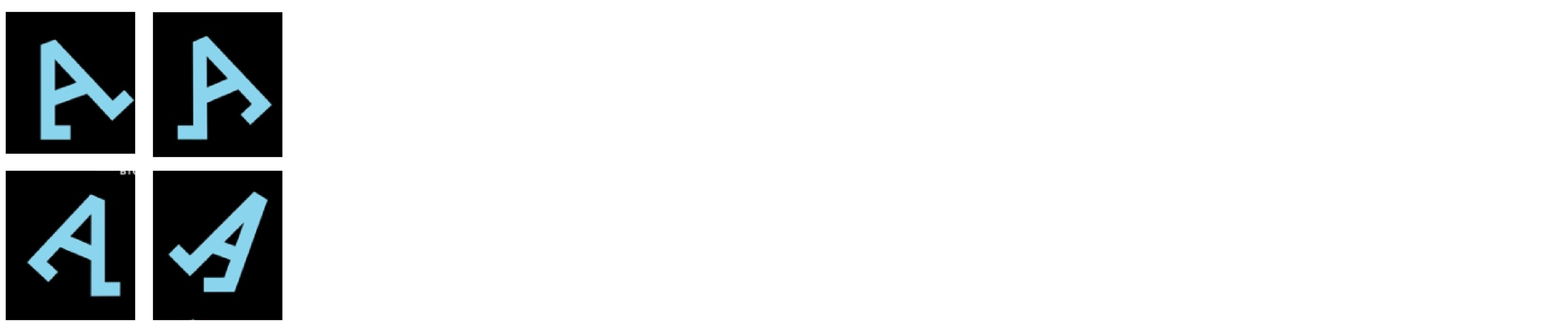
When we see something for a time that is not enough for our brain to observe, we only get the half of the story.
Tachistoscope is an instrument used for exposing objects to the eye for a very brief measured period of time. Here we use it to show our poster to our participants. We showed them our poster for only 25ms. for once and asked them to write down what they saw.
So I showed the poster to 3 people and this is what they saw in order,

It is obvious that the participants can differentiate the background and the foreground elements, they were able to see the Letter A, some white letters and some smaller texts.

Participants were not able to follow a path to understand the context of the poster. They desperately looked for some information about the poster but they were mainly distracted by the repeated headline and it took them some while to get to the context (name of artists/date/place etc.).

Our poster works in terms of most of the Gestalt principles, yet still when we see it overall without enough time, we can not even have a clue what is this about. It's flickering, contrasted by brightness, and does not give a hint about the context if we don't stop to see what is happening there.
We will study emotions in graphic design in this order:
Maybe we are, maybe not. By affected, we mean what we felt emotionally for a short moment. Does this poster creates an affect on us on a positive or negative way?
Well in this case, the flickering letters got our attention at first as we know from the heat map. We look around the poster to find something to understand the context and it might get stressful? And what about the dark background? What kind of an affect does it have on us, if there is one?
By the colors, the contrast in color or in brightness, the movement, the images, photographs in it... The thing it is saying, the concept it has, maybe we feel what posters shows us? With my poster, yes it looks flickering and I would say it is a dark poster but let's see if this darkness or fullness really affect people or not.
To observe the affection our design creates on other people, we can use affect grid as a tool. We use affect grid to compare the affect our poster creates on the viewers with the mood they had before they look at the poster.

As we see, there isn't much of a change in my case. Then we might say that our poster does not have an affect on people directly.
What do we feel emotionally when we look at this poster? What kind of an expression it has us humans can relate? Or does it have any?
We see the colors and the contrast.

We see the letters like spreaded lego pieces. They are spread all over the layout, and they look like they were put there as pieces of something and we can collect them. Which makes us talk about the feeling of touching.
With the A letters, we can feel the movement, which puts us in a situation where we can feel with. Maybe because the A letters are drunk? Or just happy? Or just goofing around? We do not know what is the truth though we still feel the movement with them.
Well I expect this poster to give a dark, gloomy mood because of the black background. Let's see if that is correct.

We now try to assess all the aspects of emotions in graphic design. The following categories seem appropriate to describe the graphic design:
Affection
Empathy
Mood
A semantic differential is a tool where we ask the participants how they feel in terms of certain emotions in between the scale of their opposites, after they look our graphic design.
So when we build the semantic differential tool, we consider these 3 questions: "Are we affected?" "Do we feel with it (empathy)?" and "Which mood is conveyed?"

As I mentioned before, there isn't a certain affection on viewers when they look at the poster but still, I wanted to know if they felt closer to stressful or peaceful for example to help me make an observation for the mood and empathy. We see in our outcome that participants did not feel a dark/gloomy mood. So why can this be? A poster with a huge black background does not give a dark mood? Maybe the exhausting part which are the foreground elements obviously has an impact on that? Let's talk about it more.
The first implication we can make for "Emotions" part for this graphic design is that normally, we believe this kind of a black usage might suggest a dark mood. But here, we see our participants did not think it is a poster with a dark mood. And with the outcome of "exhausting" from our semantic differential, it is obvious that the foreground elements are creating a contradiction by overwriting on the black background. So it makes us think that the black background is overwritten, it is absorbed by the text. Therefore, the poster does not create a dark mood. Another implication we can talk about is the "appealing of a human." Eventhough, there is no human figure realisticaly, there are these A letters which were found clumsy and drunk-ish because of their movement. Makes us talk about an expression of a human, therefore empathy.
Now let's see how our poster is designed!


Questions are:
Which arrangement is suggested by the format?
How are elements arranged?
Is there balance?
Is there a guiding principle (e.g. a grid)?


On our poster there is a visual element everywhere, the layout is stacked with them so there is even no possibility to expose balance here.

I think we can answer to that with a "yes". Because the A letters makes us look around the whole poster, which I think the idea here was to use the layout as a city or basically an area that letters can wander around. That gives us a little bit understanding of the context which is the exhibition's concept: wandering around in the city.

Let's see examples above similar to our graphic design, they are also almost constructed the same way as our design. The layout is filled, elements are arranged line by line. So maybe we can assume this is a common and known way to design a layout, especially maybe when working with a typography being the most dominant or the only element on the layout.
How do the signs try to express meaning?
Rather than being direct, signs help us come up with creative solutions while designing. We don't show what we want to show in direct correct way but instead; to be rhetoric, we use signs which are the things standing for something else. So, let's be "rhetoric" and see what visual stuff we can do, using semiosis. Oh of course, what is semiosis right? It is in the simplest terms, the science of signs. Which we use in our designs. On our graphic design, we can show something in opposite, or be ironic, we can use metaphors, personify, we can use metonymy, we can exaggerate. On my poster, when I search for a rhetorical trope, I only find the A letters might be something related? Let's check it, can we put it under the rhetorical trope of personifying? No, not really. Because, "Aylaklar" means "people who wander around with nothing better to do". So, here when the designer made A letters like walking people, there is no rhetorical thing going on. It is just amplifying what is being told.
How do different “semiotic modes” play together?
On my graphic design, there is nothing else except for typography but from the A letters which almost act like humans, and the relationship they have with the rest of the elements, we can say that the context (consept of the exhibition) was aimed to show. Like I mentioned on construction part with "Does the arrangement suggest meaning?" question.
Let's see our rhetorical tropes in some ad posters I designed for a Window Company I call "Window X"


Modernism has relegated the idea of beauty to function, so “form follows function”. A commitment to “beauty” is seen as problematic. That design should not be about “beautifying” is a common statement. However, this very discourse of modernism has concealed that modernism is an aesthetic in itself!
Meanwhile, we as designers deal with aesthetic judgements all the time. Therefore, the first and most important task is to become more aware of our own aesthetic biases.

Following Kant’s aesthetic (Critique of Judgment, 1790), the aesthetic judgement is not concerned with questions like: Is this working, is this good design? To get closer to our aesthetic judgement, we try to separate the “good” and the “bad” from the “beautiful” and “ugly”.

Now we can more elaborately talk about what we love here.

My Aesthetics Starter Pack


What has the potential for pleasure in the poster I chose looks like the small typographic game going on with the A letters. People who loved the poster or who thought it has good design solutions, agreed on the typography being attractive and interesting. They also thought the poster is simple and clear, and catches attention with the bold typography and the contrast of brightness.
After putting all my aesthetics in the starter pack, I realized this was the reason from the beginning I chose "Aylaklar" for this report. I love seeing typography having the most impact on a design, and if it includes an idea within itself, then it is the best thing I can look at. Secondly, the darkness and the contrast of brightness and colors working with it. I realized I have a lot of those too in my starter pack, which is also the case in Aylaklar.
We are now finally and surely in society with our poster! How does society shape it and how does the poster “actively” take part in society?
This is a poster for an art exhibiton of 5 Turkish artists who lived in Paris in different times coming together with their work, related to the concept of "Walking".
Designer of this poster is Özge Güven. An Istanbulbased Art Director. She designed it for the exhibition "Aylaklar", which is contributed by Cité des arts guest artist program. The clients were İKSV (Istanbul Foundation for Culture and Arts) and Institut Français Turquie.
I believe the designer made the poster digitally and it includes only text with a little bit deformation so probably on Illustrator. And how is it printed? I think they used digital printing because it is only a poster with 2 colors and black so it shouldn't be needing too much effort to print on a paper. Also these posters were not displayed in too many areas so I think digital printing looks suitable. I also thought about screen printing but that would be too expensive and unnecessary so I do not think there is a chance.

This poster needs to be displayed spesifically in Istanbul/Turkey. Because the exhibition takes place in Istanbul, Intitute Français Turquie. So it is a really exclusive thing, so that mostly it would only concern the ones who cares to see it. Which makes the viewers who understand the context of this poster privileged. Also considering the economical situation Turkey is in for years (yes it was bad in 2017 too), going to this exhibition would be only possible for the people already living in Istanbul and can afford to go see an exhibition in another city.

Discourse of my poster is that it is a high cultural thing. The viewer should be able to understand what is the poster about just by looking at the title or maybe looking at the artists contributing. Because that is all we see in the poster. A headline which is repeated, names of the artists, date/place and logos. So that the viewer should at least have some kind of a knowledge or interest for this exhibition to be drawn by the poster.

Another really hot summer day in Karaköy... Sun is rising but I can't see it. It's rising from behind all these buildings. Do you see?
Hey you should keep walking then turn right and keep wal- Oh hi! Oh who's that? Why is this person looking at me? That tourist is looking at me now! Hey! Are you interested? What are the odds, right? Normally, I've been here for three weeks, all day, all night, but nobody has ever stared at me. They just pass... 1 out of 50 maybe, looks at me but just for couple of seconds. So I am not really used to being stared. Btw, that person is still staring at me. I think I should talk to them. Wait, they say something. What is it? Haha you like me? Wow, what is the part that you like of me the most?
While I was trying to talk to the tourist, someone new just stopped in front of me. Now the new stranger is talking to the tourist. They are talking about me!
Well, this is the day of my life... I have been here for weeks, and this is the first time people are actually interested in me! Hold on, hold on! They are leaving! Where, where are you going? Please come back!
They are gone. Well yeah, I'm sure they'll be back soon to keep talking about me. Heh heh.
...
Okay, it's been 3 days and nobody came back. I am starting to doubt if they ever come back.
...
Okkkaayy, it's been a week and neither the strangers I met or someone else is here... I feel neglected and alone again. I mean, I was used to not getting attention like... Why did I have to taste the joy even for 5 minutes? Nobody stops by and checks me out. Why am I even alive? Oh, an eye contact! How delightful! Yeah, someone just looked at me in the eye for some miliseconds? Well, I better get used to that, again.
Some people came here today, and killed some of my friends and just replaced them with others. That was unacceptable! I am going to sue them. Who the hell they think they are?
Another week passed after I got enlightened by the new guy next to me. I know my purpose, who to attract. I'm getting attention sometimes with my flickering letters. But mostly that's it. After that tourist, only like 4-5 people looked at me more than a second I guess. And as far as I've heard, today is the day I will be reincarnated. So, maybe this time, I also might be born with an open hearth surgery image, and get some attentions! Who knows, right? Jk, I know it is not the only attractive thing. I've been hearing the implications and observations for me from the researcher of this report (because she reads out loud everything she types, jeez) and I know I am not much of affective, but I still got it, for the ones who care.